


After 450 years of the Mercator Map, the UN says it’s time to see Africa at its true size –
For more than four centuries, the Mercator map has shaped the way millions of people see the world. Now, the United Nations is calling for a change.
On September 4, 2026, the UN General Assembly overwhelmingly backed a resolution promoting maps that represent the relative size of continents more accurately, with a particular focus on Africa. The resolution passed with 164 votes in favour, one against and six abstentions.
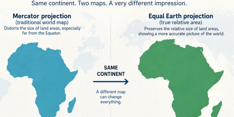
At the heart of the debate is a striking geographical reality: Africa is far bigger than it appears on the traditional Mercator map.
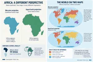
The clearest example is Greenland. On a Mercator map, Greenland can appear almost comparable in size to Africa. In reality, Africa covers more than 30 million square kilometres, compared with Greenland’s 2.2 million.
Africa is about 14 times larger.
The distortion comes from the way the Mercator projection works. Created by Gerardus Mercator in 1569 for maritime navigation, it preserves angles and directions but increasingly exaggerates land areas towards the poles.
As a result, Greenland, Canada, Russia and northern Europe appear disproportionately large compared with regions closer to the Equator, including Africa.
The map does not technically shrink Africa. It enlarges high-latitude regions around it, dramatically altering our perception of their relative size.
Equal Earth puts Africa back in proportion
The UN resolution supports greater use of equal-area projections, including Equal Earth, when the objective is to show the true relative dimensions of the world’s regions.
Developed in 2018, Equal Earth preserves the proportional area of countries and continents. And the difference is immediately visible.
Africa suddenly looks huge.
Not because the new projection makes it larger, but because it shows its area in the correct proportion to the rest of the world.
At approximately 30.37 million square kilometres, Africa is the second-largest continent on Earth. Its scale is difficult to grasp from the map many of us grew up with: the United States, China and India could fit inside Africa together, with millions of square kilometres still remaining.
The initiative behind the UN resolution, promoted by Togo on behalf of the African Group and supported by the African Union, argues that this is not only a question of cartographic accuracy.
Maps influence how generations understand the world.
A representation repeated in classrooms, books, media and digital platforms eventually becomes part of our mental geography. For Africa, that has meant centuries of appearing smaller in relation to northern regions than it actually is.
The UN is not banning the Mercator projection. It remains an important map for navigation, the purpose for which it was originally designed. The resolution instead calls for more appropriate projections when maps are used to compare the size of countries and continents.
That distinction is important: there is no perfect flat map of a spherical planet. Every projection involves a compromise.
But if the question is how much space a continent actually occupies on Earth, an equal-area map offers a very different picture.
And nowhere is that difference more powerful than in Africa.
More than 450 years after Mercator drew his famous map, the UN vote is asking the world to reconsider an image it has long taken for granted.
Africa has not become bigger. We are simply beginning to see how big it has always been.
After 450 years of the Mercator Map, the UN says it’s time to see Africa at its true size